Cabinet Colour Sets the Tone for Your Entire Kitchen
Kitchen cabinets typically cover more visual surface area than any other element in the room — walls, countertops, and flooring included. The colour you choose for those cabinets fundamentally shapes the kitchen’s mood, perceived size, and style. Get it right, and everything else in the kitchen falls into place. Get it wrong, and even the most expensive countertops and appliances can’t compensate.
In 2026, kitchen cabinet colours are moving in several directions simultaneously. There’s a continued push toward warm, natural tones that feel organic and grounded. Bold, saturated colours are appearing on islands and lower cabinets. And white remains popular but has evolved into softer, warmer variations. Here’s a detailed look at what’s trending and, more importantly, what will actually work in your kitchen.
White Cabinets: Still Popular, But Warmer
White kitchens aren’t going anywhere. They’re bright, clean, and versatile. But the crisp, blue-white cabinets that dominated the past decade are giving way to warmer whites and off-whites. Think cream, antique white, Swiss Coffee, and similar shades that read as white but with a warm undertone.
Why Warm White Works
- It pairs beautifully with natural wood, brass hardware, and warm-toned countertops
- It softens the clinical feel that stark white can create
- It’s more forgiving of colour variations in natural light throughout the day
- It works with the broader design trend toward warmth and comfort
When to Choose White
White cabinets are especially effective in small kitchens, dark kitchens, and galley layouts where you need maximum light reflection. They’re also the safest resale choice — virtually every buyer finds white cabinets acceptable, even if they wouldn’t choose them personally.
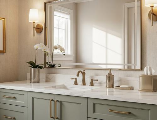
Greige and Warm Grey: The New Neutral
Grey cabinets were the dominant trend for several years, but pure grey can feel cold and sterile in northern light — which is exactly the light most Kitchener-Waterloo kitchens get. The current evolution is greige: a grey-beige hybrid that has the sophistication of grey with the warmth of beige.
Popular Greige Tones
- Mushroom: A medium-toned greige with earthy undertones
- Pebble: A lighter greige that reads almost white in bright light
- Stone: A deeper greige that works well on lower cabinets or islands
- Warm taupe: Closer to beige but with enough grey to avoid looking dated
Pairing Greige Cabinets
Greige pairs naturally with white quartz countertops, brushed gold or black hardware, and warm wood flooring. It also works surprisingly well with a two-tone approach — greige lowers with white uppers, or greige perimeter with a darker island.
Navy Blue: Bold but Timeless
Navy blue has emerged as the most popular bold cabinet colour, and for good reason — it has the depth and drama of a dark colour without the heaviness of black. Navy cabinets feel classic rather than trendy, which gives them staying power that other bold colours often lack.
How to Use Navy
- On the island only: The most common and safest approach. A navy island against white or greige perimeter cabinets creates a striking focal point.
- On lower cabinets: Navy lowers with white uppers is a two-tone combination that grounds the kitchen visually while keeping the upper portion light and airy.
- Full kitchen: Navy throughout works in larger kitchens with ample natural light. It creates a moody, sophisticated atmosphere but requires lighter countertops and backsplash to balance the darkness.
Navy Pairings
Navy pairs beautifully with brass or gold hardware, white marble-look quartz, and warm wood accents. Avoid pairing navy with cool silver hardware unless you want a nautical look.
Forest Green and Sage: Nature-Inspired Colour
Green cabinets have been building momentum for several years and are firmly established in 2026. The range runs from deep forest green to soft sage, and each variation creates a very different effect.
Sage Green
Soft, muted sage is appearing on full kitchens, especially in cottages, farmhouse-style homes, and kitchens that want a relaxed, organic feel. Sage works well with natural wood countertops, brass hardware, and open shelving. It reads as neutral enough for broad appeal while being distinctive enough to stand out.
Forest Green
Deep, saturated green creates a luxurious, dramatic kitchen. Like navy, it’s most commonly used on the island or lower cabinets and paired with white or cream uppers. Forest green with marble-look countertops and brass accents is one of the most refined colour combinations available right now.
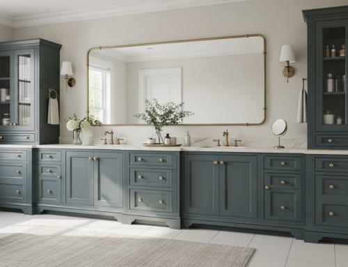
Charcoal and Black: For Maximum Drama
Charcoal and black cabinets make a strong design statement. They’ve moved beyond contemporary and minimalist kitchens into more traditional spaces, especially when combined with warmer elements.
Making Dark Cabinets Work
- Ensure ample lighting. Under-cabinet lighting, pendant lights, and recessed ceiling lights are essential. Dark cabinets absorb light, so you need more of it.
- Contrast with light countertops. White or light-veined quartz countertops prevent the kitchen from feeling like a cave.
- Add warm accents. Brass hardware, natural wood open shelving, and warm-toned backsplash materials prevent dark cabinets from feeling cold.
- Consider a matte finish. Matte black or charcoal has a softer, more sophisticated look than gloss, which can show fingerprints and water spots.
Natural Wood Tones: The Return of Warmth
After years of painted cabinets dominating the market, natural wood is making a significant comeback. But this isn’t the orange oak of the 1990s. Today’s wood-tone cabinets feature lighter species like white oak and maple, often with a clear or light stain that highlights the natural grain.
Popular Wood Finishes
- White oak: The most popular wood species for cabinets right now. Its straight, prominent grain adds texture and character without overwhelming the design.
- Rift-cut or quarter-sawn oak: These cuts produce a more uniform grain pattern that reads as modern and refined.
- Light maple: A blonde, fine-grained wood that creates a bright, Scandinavian-inspired look.
- Walnut: For a darker, warmer wood tone with rich chocolate-brown colouring. Often used as an accent or on the island.
Mixing Wood and Painted Cabinets
One of the strongest trends in 2026 is combining natural wood cabinets with painted ones. Common combinations include:
- White uppers with white oak lower cabinets
- Painted perimeter cabinets with a walnut island
- Wood open shelving integrated into a painted cabinet kitchen
This mixing approach adds visual interest and warmth without committing fully to either painted or wood cabinets.
Two-Tone Kitchens: Combining Cabinet Colours
Two-tone kitchens — using different colours for the upper and lower cabinets, or for the perimeter versus the island — continue to be one of the most popular design approaches in 2026. Done well, a two-tone scheme adds depth and visual interest. Done poorly, it looks disjointed.
Two-Tone Combinations That Work
- White uppers + navy island: Clean, classic, broadly appealing
- White uppers + charcoal lowers: Contemporary and striking
- Greige uppers + white oak island: Warm and organic
- White perimeter + sage green island: Fresh and distinctive
- Light grey perimeter + walnut island: Sophisticated and warm
Two-Tone Rules to Follow
- Keep the lighter colour on the upper cabinets to prevent a top-heavy feeling
- Use the same hardware finish throughout to tie the two colours together
- Connect the two colours through the countertop — choose a countertop with veining or patterns that include both tones
- Stick to two colours maximum. Three or more distinct cabinet colours create chaos, not character.
How to Choose a Cabinet Colour That Lasts
Trends are useful for understanding what looks current, but your kitchen needs to work for you for 10 to 20 years. Here’s how to choose a colour that you’ll still love down the road:
- Consider your home’s existing palette. Your kitchen cabinet colour should complement the flooring, trim, and adjacent rooms. Bring samples home and view them alongside your existing finishes.
- Test in your actual light. Colours look dramatically different under showroom lighting versus the north-facing natural light in your kitchen. Always bring samples home and view them at different times of day.
- Think about maintenance. Lighter cabinets show fingerprints less but show food splatter more. Darker cabinets hide spills but show dust and fingerprints. Matte finishes are more forgiving than gloss for both.
- Start with the countertop. There are thousands of cabinet paint colours but far fewer countertop options. It’s easier to match a cabinet colour to a countertop you love than the reverse.
Explore our kitchen cabinet door styles to see how different colours look on various door profiles. The combination of colour and style creates the final effect, and seeing them together is essential before making a decision.
Find Your Perfect Cabinet Colour
Choosing a kitchen cabinet colour is one of the biggest design decisions you’ll make in your renovation. Take your time, bring samples home, and don’t rush the decision.
Our showroom at 899 Victoria St N in Kitchener has an extensive selection of cabinet colours, finishes, and door styles from leading manufacturers. See them in person, compare options side by side, and get expert guidance from our team. We help homeowners throughout Kitchener, Waterloo, Cambridge, and Guelph find colours that look beautiful and stand the test of time. Contact us or call (519) 744-2284 to visit.